Thursday 18 December 2014

Possible Article Photographs


Here are a few pictures that I could have used for my double page spread. The lighting of all of these images are exceptional. However, I feel that the images that I have chosen will work better on my double page spread than these as they look effective together and compliment each other.

Saturday 13 December 2014

Final Contents Page

This is my final contents page that I will use in my music magazine. I have structured it to look similar to my style model. However, I have tried to keep a sense of originality about it.

Monday 8 December 2014

Contents Style Model

My style model for my contents page is taken from NME Magazine. I chose this as I like the layout of the page and I think that it is well suited with my front cover. Using the colours from my front cover, I will create a house style for my magazine by sing them on my contents page too. I like how the image is set up in the centre of the page to draw attention to it.

Monday 1 December 2014

Contents Page Layout


Following my style model I have created a n outline for my contents page.


Thursday 27 November 2014

Live gig photo

For my contents page I decided that I did not want to use a photo of 'Fading Fault' and that I actually wanted to give my magazine that 'real' effect and use a photo from a live gig. I used a picture of Johnny Marr from his latest solo tour as in my style model NME they don't just advertise young, rock artists but they also advertise older, more 'indie' artists. Because this is my picture it made my work more personal and because I like the artist it made it easier to come up with a story to sell on the artist himself.

Thursday 13 November 2014

Editing my chosen photos

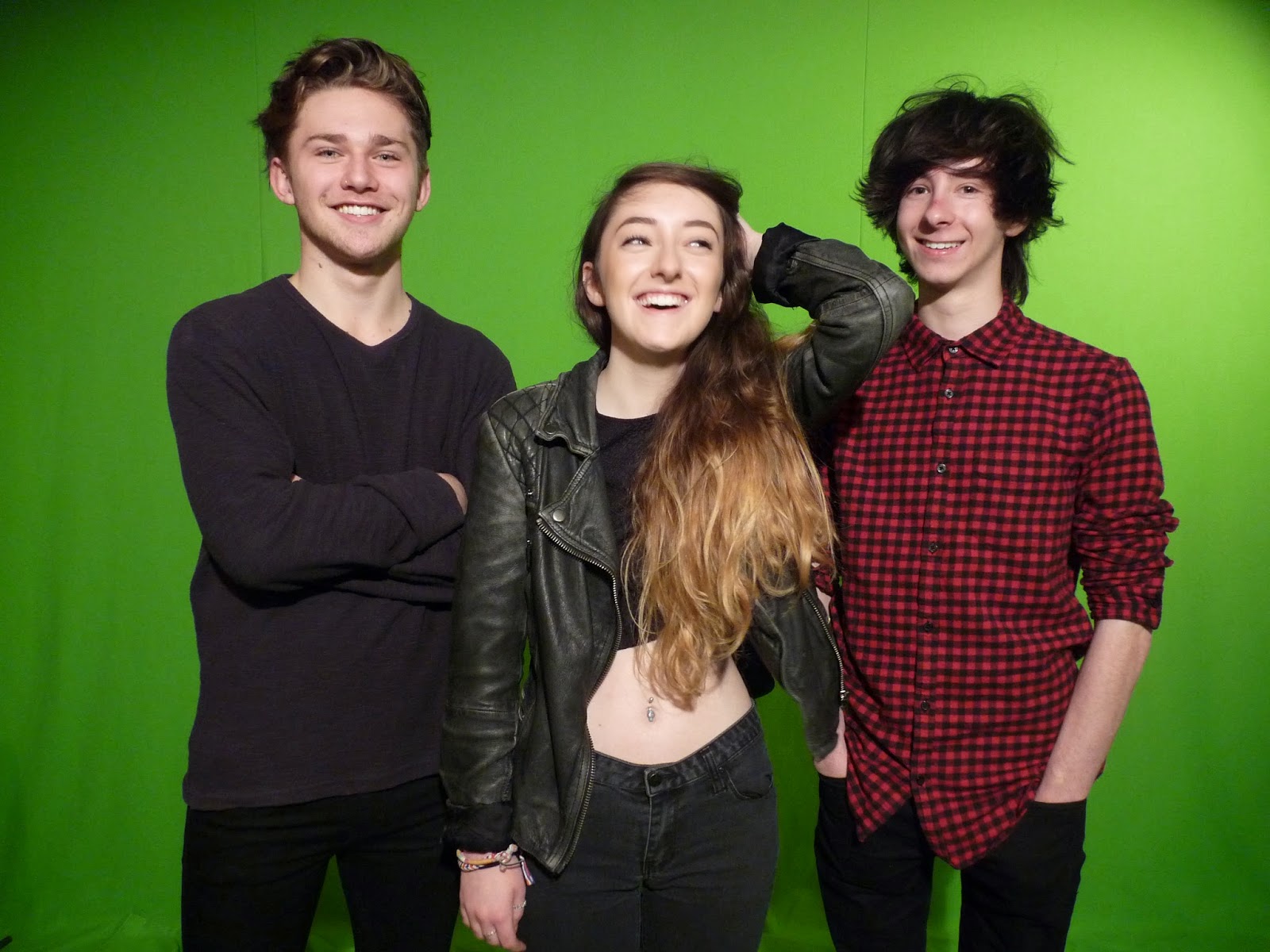
I started by selecting the Quick Selection Tool

 
I then traced around the outline of my models.
 
I then clicked on 'Select the pixel mask' so only the background was left.
 
I then inverted the picture so my models were separated from the background.
 
I then clicked mask edge to bring some of the hair that I had originally cut off of my models heads.
 
Finally, i used the magic wand tool to remove the rest of the green that was in between the arms.
 
  This is the process that I used for all of the photos that I cut out for my magazine.


Monday 10 November 2014

Models Permission

Before taking my photo's I of course needed to get my models permission to photograph them for my front cover and my article. This is because I was going to be publishing pictures of them online to my blog.

Thursday 6 November 2014

Before taking my photos

Before I could even take my photo's I had to plan out what poses that I wanted my models to do and what clothes I actually wanted them to wear. As 'Fading Fault' are a Rock band I wanted them to have a 'Grungy' look to them to give off that rebellious look, this is why I have them wearing dark colours like black but then wearing the colour red to make the page not look so dark and depressing.
I took my photographs in the schools studio, where we had a green screen set up with professional lighting for us to use. The lighting took quite a lot of fiddling to make sure that there was not going to be any green reflecting onto my models and that the photos weren't blurry or too dark for me to actually edit.

Monday 3 November 2014

Possible article photographs


Here are some photographs that I also could have used for my article. These chosen photo's could work exceptionally on my article page as they have perfect lighting and the models look as if they are having fun which is the look that I was going for on my double page spread. However, I feel that the pictures that I have chosen to use will look much better with the colour scheme that I am planning to use.

Alternative front cover photo's


Here are some of the photos that I could have used for my front cover. The lighting of the first and last photo's are better than the lighting on the second photograph as I had to play around with the lights more to make sure it was perfect and it did not reflect off of the camera lens. I am not going to use these photos as I feel that the ones that I have chosen will work better and will make a more effective front cover.

Thursday 30 October 2014

My Chosen Photo's

For my music magazine I decided use Hannah, Lewis and Lewis to make the band 'Fading Fault'. I used them as I thought that they had an indie/edgy look to them and that together; they would make a well suited and stylish band to put onto my front cover. These are my three chosen images that I wish to use for my article and my front cover as the quality of the images are good and they will make my magazine look effective.


Monday 27 October 2014

Monday 20 October 2014

Front Cover Style Model


For my style models I have decided to use both NME and Kerrang! as I think they will attract my target audience. I will interpret the features that are used in both of my style models to create a successful piece that shows how I have interpreted the style models.

Like the NME magazine I will use three people as part of a band and have the female centre of the page. I will take trates from both magazines to create what I think could be the perfect magazine. 

Thursday 16 October 2014

Naomi Wolf's Beauty Theory

Naomi Wolfs theory involves that beauty is actually used against women in the industry. It was said that beautiful women were used on the front covers on magazines to attract self-loathing women who are concious about their own looks, hence why they buy the magazines with the 'flawless' women on, to aspire like them. However, what these 'ordinary' women do not actually realise is that the women who are actually photographed have of course been photoshopped and edited to look this way. Women are made to look like this to of course attract more people to purchase the magazine, Naomi Wolf named this the Beauty Against Women Theory.

In my own magazine I intend to use a female on the cover along with two males so I am going towards a group look rather than one person standing out. Although I do not intend on using the Beauty Theory myself in my own music magazine, i do intend on centring the female on the pictures that I will be taking of the band.

Monday 13 October 2014

Super Smiler

Marjorie Ferguson: Facial Expression Theory: Super Smiler:
The Super Smiler theory is when the full face is shown and full smile is being shown. It is supposed to give off a warming and happy feel to the magazine. The look often has the windswept hair look to it or an aggressive look or approach to it too. 

Invitational

Marjorie Ferguson: Facial Expression Theory: Invitational:

The invitational look is where the eyes are the main focus of the picture and the mouth is showing little teeth or none at all. The head tends to be slightly tilted and the mood of the cover normally gives off a mischievous look. This look is to give off a hint of personality rather than sexuality  

Romantic or Sexual

Marjorie Ferguson: Facial Expression Theory: Romantic or Sexual


This is the more general classification devised which includes the dreamy, heavy-lidded, unsmiling big-heads, or the overtly sensual or sexual. The looks that are projected from this look is 'possibly' and 'definitely' available. 

Chocolate Box

Marjorie Ferguson: Facial Expression Theory:

Chocolate Box: The chocolate box theory is when the model is showing either a half-smile, full-smile, their lips together or slightly parted and their face full or three-quarters to the camera. The mood that is projected from this is blandly pleasing.

Thursday 9 October 2014

Blumler and Katz


Blumler and Katz came up with the theory of the four needs in media, they said that the media must gratify these needs:


Escapism and Diversion:
Is the theory that by reading music magazines or going onto websites it allows people to get lost in a different world and to get involved in drama e.g. with celebrities, making them focus less on their own life and more on others.

Surveillance:
By reading music magazines it gives the reader more information on different artists and things going on in the music industry. This give readers a chance to find out what is really happening the world of music and celebrities.


Personal Relationships:
Music magazines offer people the opportunity to talk to each other about the magazine and the different artists and articles featured

Personal Identity :
To gain insight to ones self, finding reinforcement for personal values and finding models in behaviour by looking into the media for example; magazines or TV
shows.

Thursday 2 October 2014

Monday 29 September 2014

Magazine Brief

Powered by emaze Here is my magazine brief that I created after collecting in my questionnaire results.

Questionnaire Results

Powered by emaze Here are the results from my magazine questionnaire.

Monday 22 September 2014

Magazine Publisher

Rheingold publishing is a company who publish magazines involving things such as music, the theatre and education and is situated in the UK. The magazine also publishes things like job opportunities and music concerts that are happening in local area's. Rhinestone tend to publish magazines that are not so much about the people in them such as magazines like Kerrang! but things that are more personal to the reader themselves.

Magazine Publisher


Bauer is Europe's largest privately owned publishing group offering over 300 magazines in fifteen different countries. As well as owning online TV and radio stations for example Magic, Metro and Kiss FM. They own magazines such as Kerrang!, Q and Closer which are all of course extremely popular magazines.

Thursday 18 September 2014

Magazine Analysis

Here is my magazine analysis that I carried out in order to begin creating my own Music Magazine. Here I looked at conventions of magazines that I could include into my own magazine.

Thursday 11 September 2014

School Magazine


For my first assignment I had to create a school magazine that would be sold and shown to parents and students of my school. The name of the magazine is 'The Heworth Times' and I created it through Adobe Photoshop. I had vague kills of using this programme through year 11 so I knew how to use a few of the tools on the programme.

  For my front cover I decided to use a dark blue background as it a colour for the school logo itself, which I also included in the bottom right corner of the magazine cover. I used Aidan as my model for the front cover as he was dressed in very formal attire which is mentioned on the front cover itself.


For my contents page I again used the main colours of the Heworth Logo and used the school logo in the left hand corner of the page again to create a trademark for my magazine. I wanted my magazine to have a house style by giving it the same colour on each page. By using a gradual effect on the contents page it made the colour look lighter and less harsh like the front cover.


Monday 8 September 2014

Hi I'm Chloe Herring and I am currently studying my first year of A Levels in which I am studying English Literature, English Language and Media Studies. This will be my way of showing how I am progressing throughout the course of my Media course.