Thursday, 12 May 2016
Wednesday, 11 May 2016
Monday, 9 May 2016
Saturday, 7 May 2016
Tuesday, 3 May 2016
Skull Design
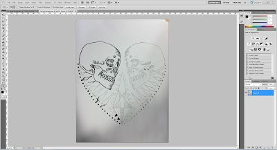
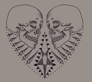
I designed and drew my skull that I will be using for my digipak and poster. I decided to use line and dot work in my design to give it that grunge feel that I want to carry on throughout my whole project. rather than doing the dots on paper, I added them on photoshop. I began by drawing my design out on paper and scanning it through onto the computer. After that I coloured in the outline to make it stand out more. The following pictures show the original design on paper, the progress of it being darkened and the final product with colour added on the background.
Monday, 2 May 2016
Change Of Song
Originally I wanted to use The 1975's song Heart Out. As i began editing my video I was beginning to realise that the song just was not making me feel the emotions that I wanted my audience to eel when watching it. Therefore I decided to change my choice of song. At the moment I am torn between Ed Sheeran's 'Give Me Love' and Coldplay's 'Fix You'. These songs will fit much better with the storyline of my video.
The 1975 Front Cover Analysis
Choice Of Font
This is the font that I have decided to use for both my digipak and my poster as I am using the same design for the both of them. I chose this font I feel that it has that edgy look that I feel my band would have.
Album Poster Style Models
For my poster I want to keep it simplistic yet effective. Like the Arctic Monkeys and Bring Me The Horizon posters below, I want to keep the same design on my poster as I do on my digipak as from listening to these bands myself i feel that this was an effective way of making the band and their album more noticeable as if the poster is noticed in a magazine with that certain design on, when it comes to buying it in a store, it is easier to recognise and it becomes a symbol of the band,
Subscribe to:
Comments (Atom)


