Thursday, 18 December 2014
Possible Article Photographs
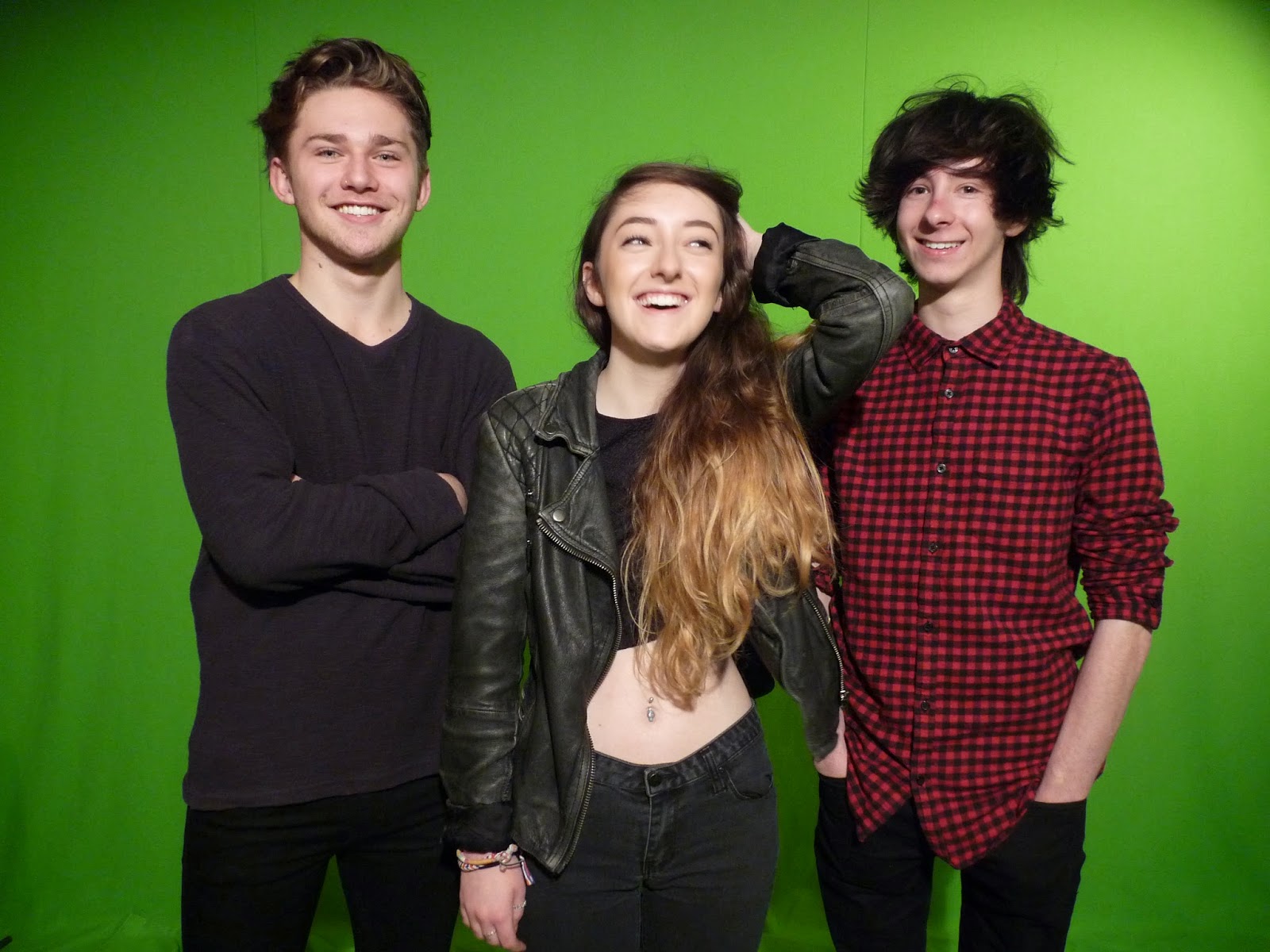
Here are a few pictures that I could have used for my double page spread. The lighting of all of these images are exceptional. However, I feel that the images that I have chosen will work better on my double page spread than these as they look effective together and compliment each other.
Saturday, 13 December 2014
Final Contents Page
This is my final contents page that I will use in my music magazine. I have structured it to look similar to my style model. However, I have tried to keep a sense of originality about it.
Monday, 8 December 2014
Contents Style Model
My style model for my contents page is taken from NME Magazine. I chose this as I like the layout of the page and I think that it is well suited with my front cover. Using the colours from my front cover, I will create a house style for my magazine by sing them on my contents page too. I like how the image is set up in the centre of the page to draw attention to it.
Monday, 1 December 2014
Subscribe to:
Comments (Atom)


